Typography System

Multilingual
Avenir Next LT Pro

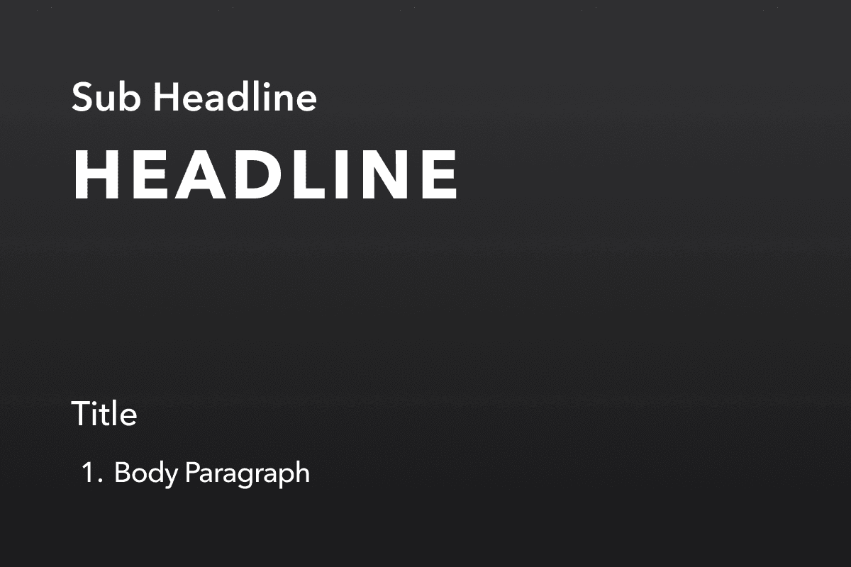
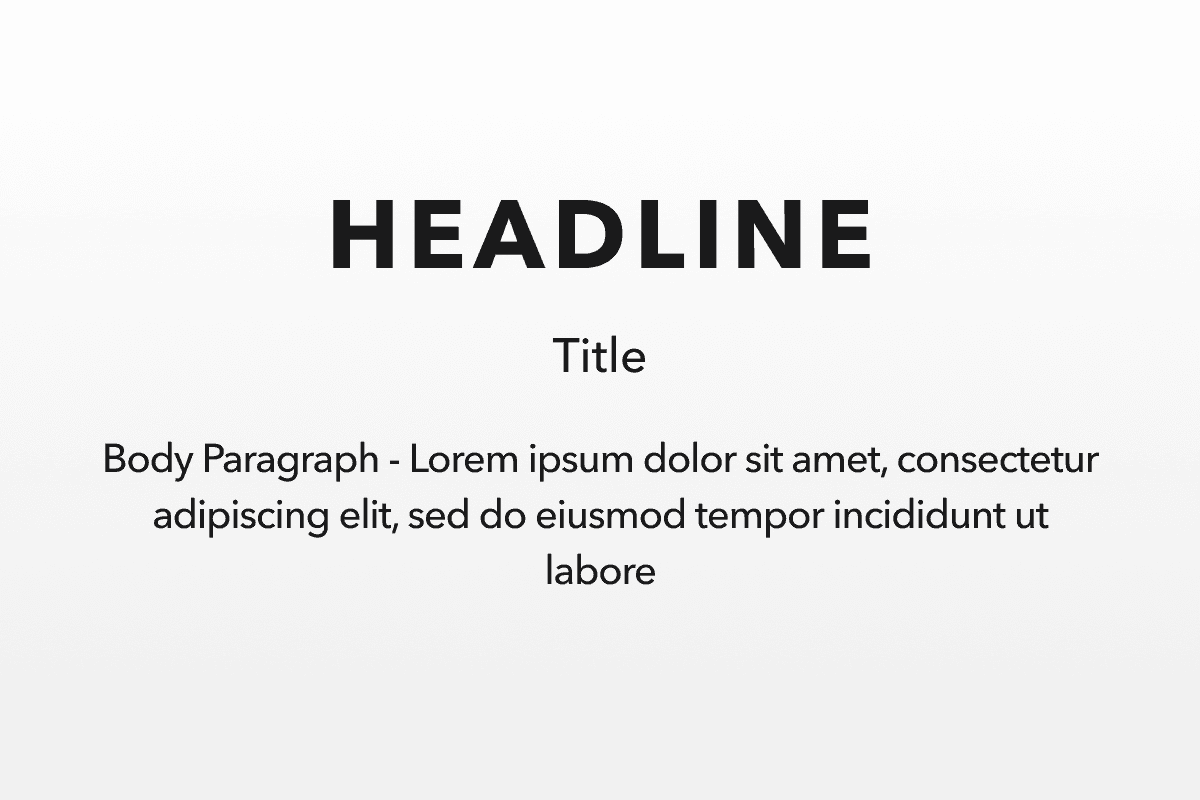
a. HEADLINE
Avenir Next LT Pro Bold, Uppercase Only
Heading is used to create various levels of typographic hierarchies.
Avenir Next LT Pro Demi
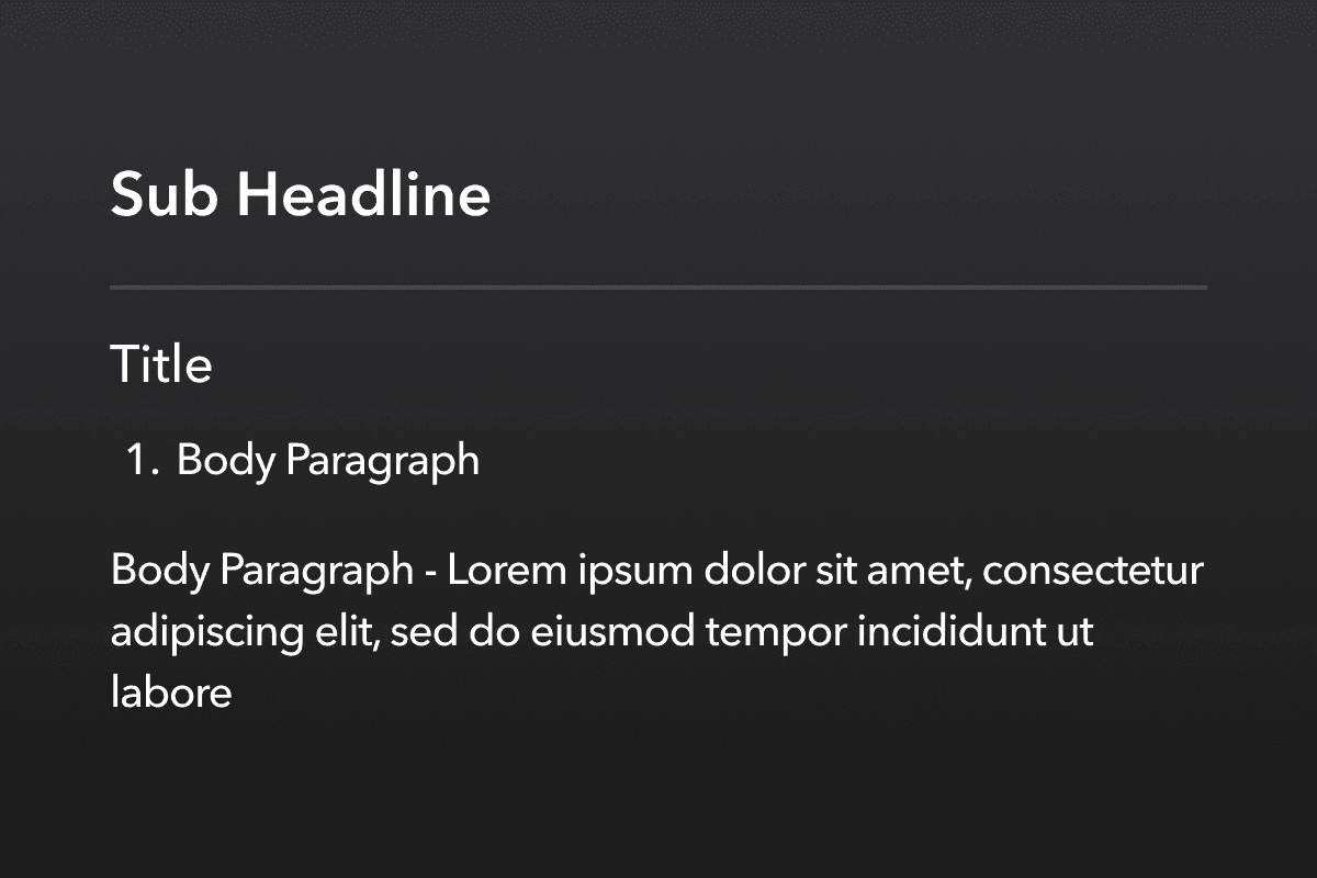
Subheadlines are used to complement the content of headlines or when creating titles that are part of the headline's content.
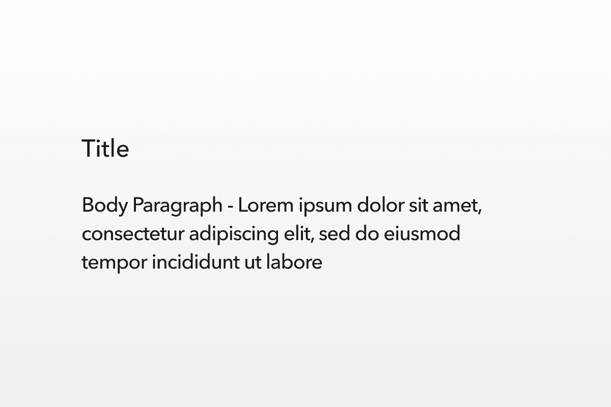
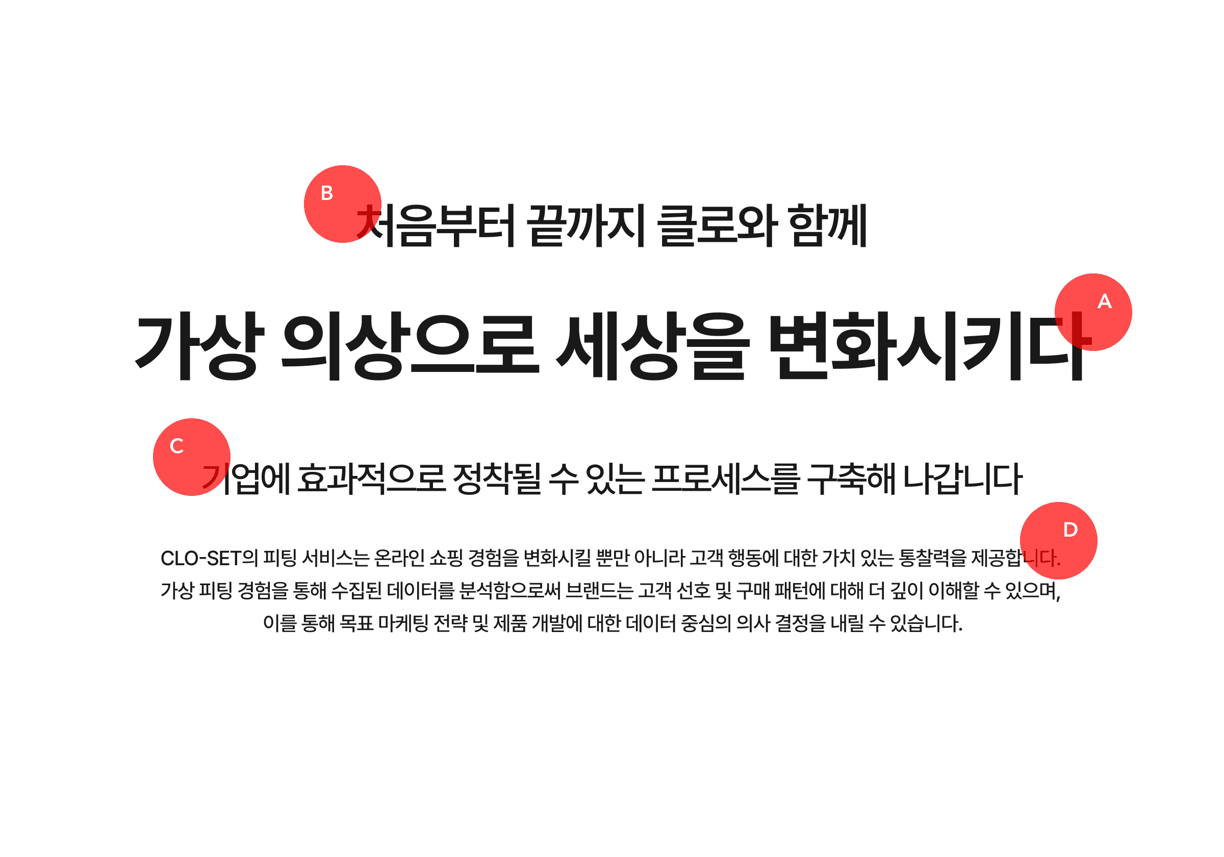
c. TITLE
Avenir Next LT Pro Medium
Titles are used as subheadings for longer paragraphs or for emphasis within the body of the text.
D. Body
Avenir Next LT Pro Medium
They are commonly used for main text and supplementary content.
Pretendard
a. HEADLINE
Pretendard Bold
Heading is used to create various levels of typographic hierarchies.
B. SUBHEADLINE
Pretendard Bold
Subheadlines are used to complement the content of headlines or when creating titles that are part of the headline's content.
c. TITLE
Pretendard Medium
Titles are used as subheadings for longer paragraphs or for emphasis within the body of the text.
D. Body
Pretendard Regular
They are commonly used for main text and supplementary content.
Source Han Sans SC
a. HEADLINE
Source Han Sans SC Bold
Heading is used to create various levels of typographic hierarchies.
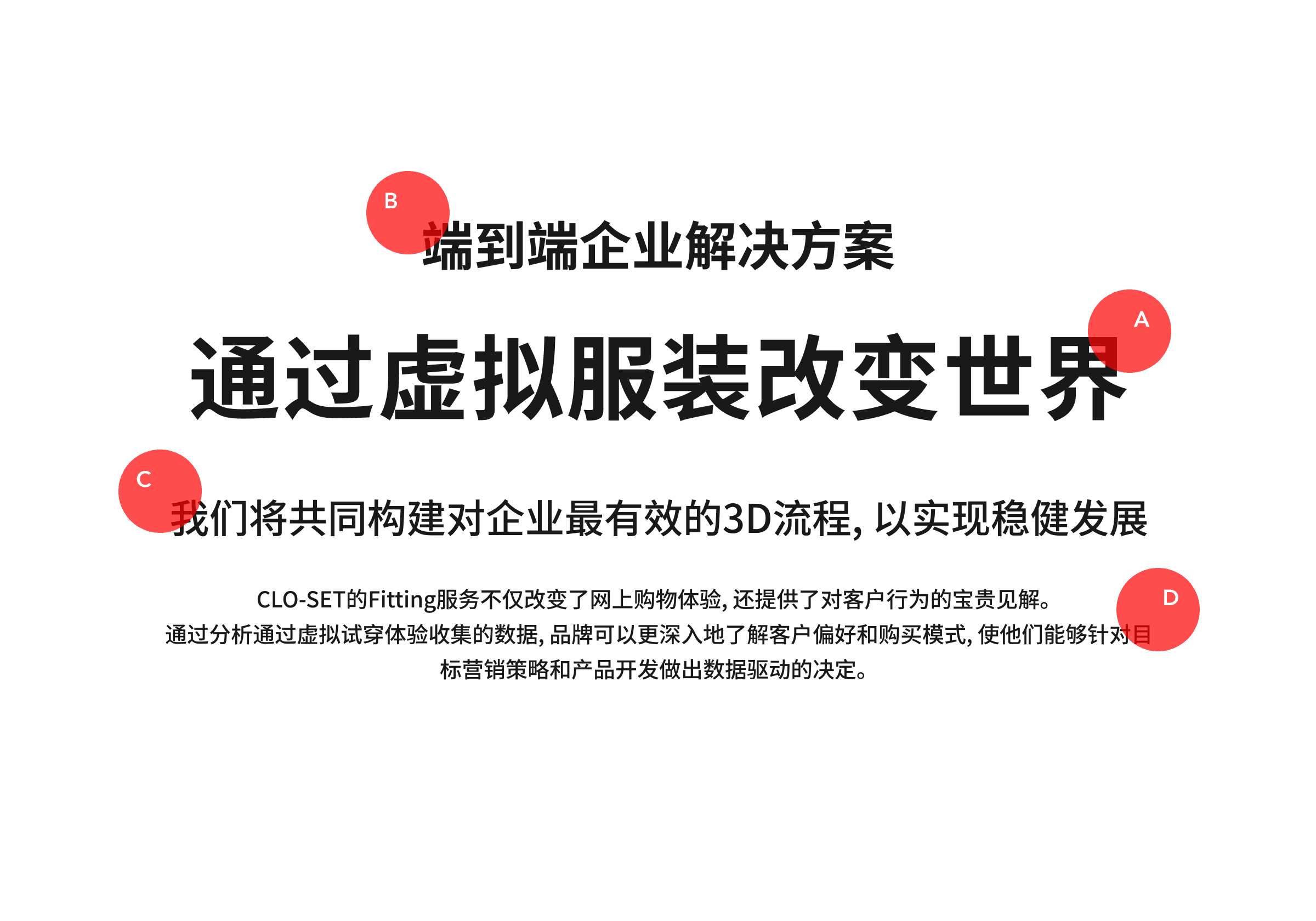
B. SUBHEADLINE
Source Han Sans SC Bold
Subheadlines are used to complement the content of headlines or when creating titles that are part of the headline's content.
c. TITLE
Source Han Sans SC Medium
Titles are used as subheadings for longer paragraphs or for emphasis within the body of the text.
D. Body
Source Han Sans SC Regular
They are commonly used for main text and supplementary content.
BIZ UDGothic
BIZ UDGothic is an effective typeface with a wide range of Unicode characters,
including standard and special characters from the Japanese language, ensuring beautiful text representation.
a. HEADLINE
BIZ UDGothic Bold
Heading is used to create various levels of typographic hierarchies.
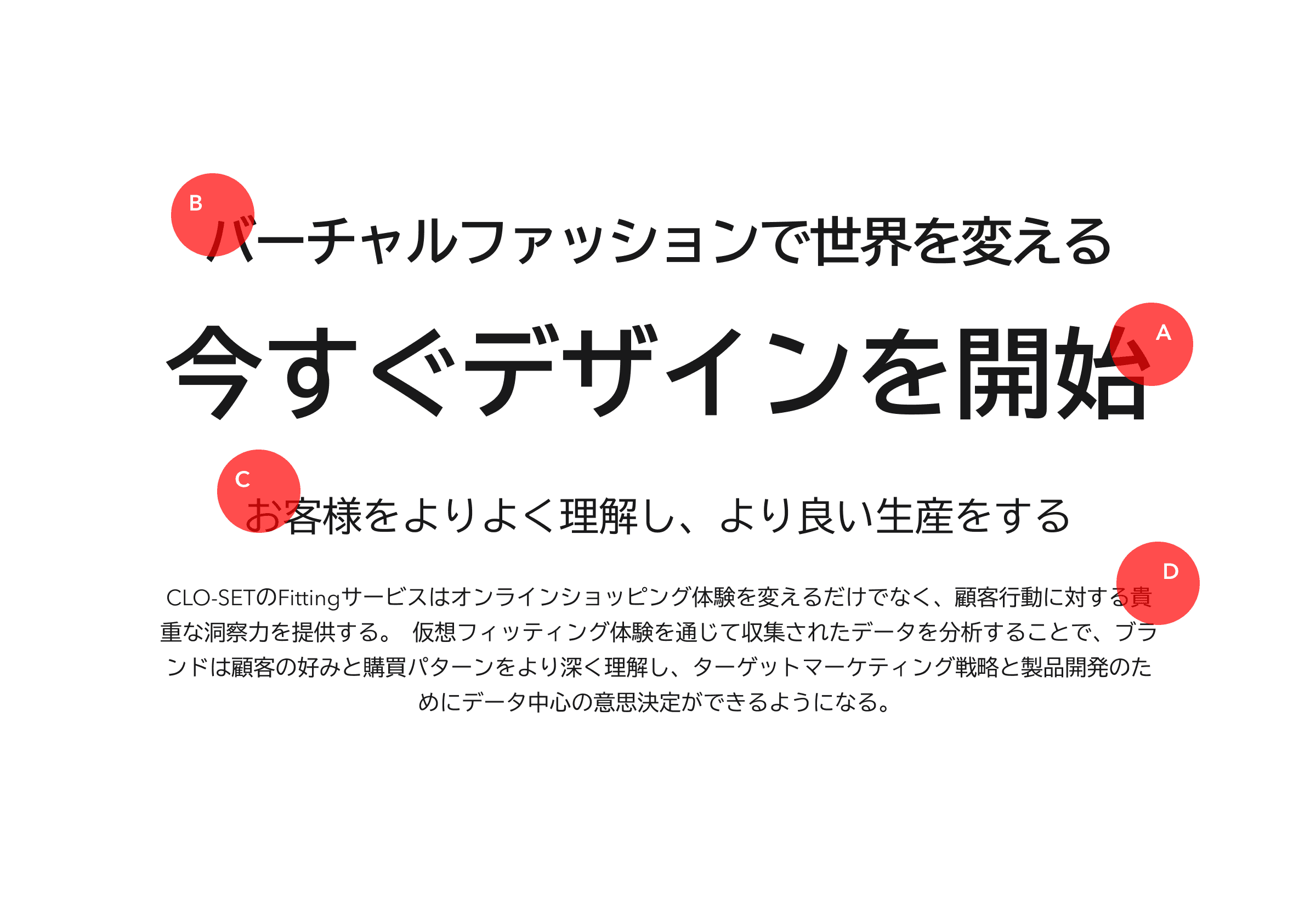
B. SUBHEADLINE
BIZ UDGothic Bold
Subheadlines are used to complement the content of headlines or when creating titles that are part of the headline's content.
c. TITLE
BIZ UDGothic Regular
Titles are used as subheadings for longer paragraphs or for emphasis within the body of the text.
D. Body
BIZ UDGothic Regular
They are commonly used for main text and supplementary content.